AI-Augmented Design System
Reusable Component Libraries for Rapid AI Prototyping
AI Prototyping • Design Systems • Figma MCP
The Problem
Building high-polish UI prototypes presents a significant challenge: replicating components and quickly assembling unique prototypes for different use cases over and over again. Our team was being tasked to create prototypes for different demos across various use cases, and we needed to move fast.
The traditional approach of building each prototype from scratch was:
- Time-consuming and repetitive
- Inconsistent across different prototypes
- Difficult to maintain quality at speed
- Hard for team members to onboard and contribute
The Solution
I followed Colin Matthew's method for creating reusable component libraries optimized for AI-assisted development. The approach focuses on building a comprehensive component library first, then using AI tools to rapidly assemble high-fidelity prototypes.
In this case, we were working on our Data Prep Editor on the canvas. I created a component library specifically for the visualized representation of stages and UI elements that could be rapidly composed into different configurations.
The Process
First, I leveraged a specialized prompt for creating the component library. This prompt was designed to generate production-ready React components with consistent styling, proper accessibility, and flexibility for different use cases.
The Prompt:
You are tasked with creating a component library based on a screenshot, using NextJs, React, and Tailwind CSS. All components should be custom-made to match the screenshot as closely as possible. Follow these instructions carefully:
- Analyze the provided screenshot
- Identify distinct UI components in the screenshot. These may include, but are not limited to:
- Buttons
- Input fields
- Navigation bars
- Cards
- Modals
- Typography elements
- For each identified component:
- Create a React functional component
- Use Tailwind CSS classes to style the component, matching the visual design in the screenshot
- Ensure the component is responsive and accessible
- Add any necessary props for customization
- Include a brief comment describing the component's purpose
- After creating all individual components, create an index page that imports and displays each component with example usage.
Remember to use only custom-made components and Tailwind CSS classes. Do not use any external libraries or pre-built components. Strive to match the visual design in the screenshot as closely as possible while maintaining good coding practices and component reusability.
Using the component library creation prompt, I provided screens through Figma MCP integration. The AI tools built the initial screen implementations based on the design specifications, translating visual designs into functional code.
Once the initial build was complete, the next step was refining the UI components. This involved adjusting styling, improving interactions, and ensuring components worked seamlessly together across different configurations.
With refined components in place, I started building different use cases for demos and prototypes. The modular nature of the component library made it easy to assemble new variations quickly.
Finally, I pushed the prototypes to Lovable so other team members could remix and build upon them. This enabled collaborative iteration and allowed the team to create their own variations without starting from scratch.
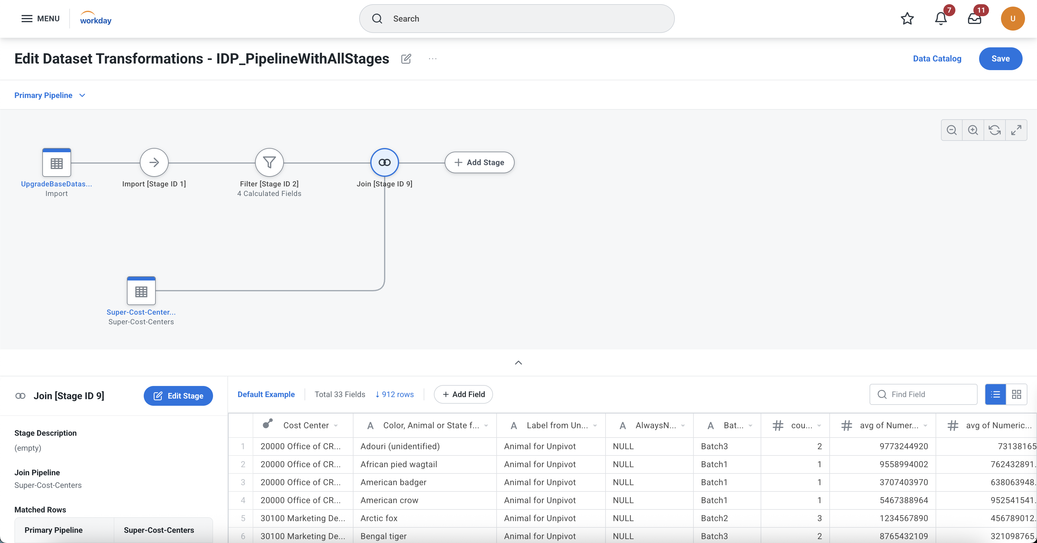
Data Prep Editor interface with visual pipeline stages
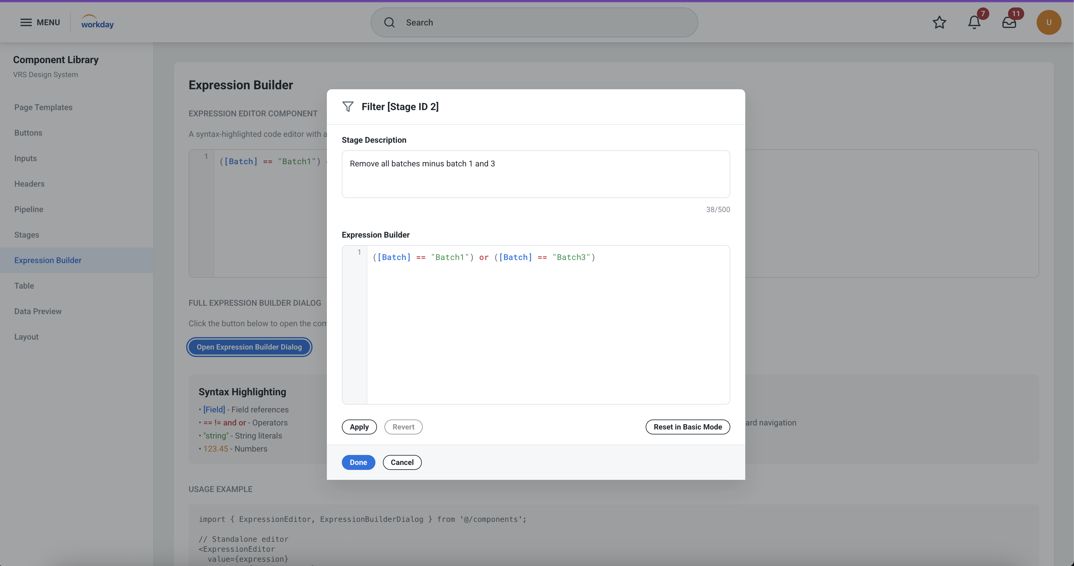
Expression Builder component with syntax highlighting
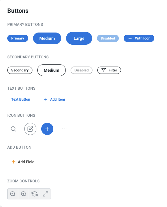
Standardized button components ensuring consistency across all prototypes
Results & Benefits
Deterministic, Polished Output
While there's still upfront work required to build the component library, this investment quickly pays off. The method enables creating high-fidelity prototypes with consistent, deterministic output every time.
All prototypes share the same visual language, making them feel cohesive and professional regardless of who builds them.
Changes to components propagate across all prototypes, making it simple to update and improve the entire collection.
Team members can quickly start building prototypes using the established component library without learning everything from scratch.
New demo variations can be assembled in a fraction of the time compared to building from scratch.
Key Takeaways
- Invest in the foundation: The upfront work of creating a robust component library pays dividends in speed and consistency.
- AI amplifies, not replaces: AI tools are most effective when given well-structured components to work with.
- Enable your team: Publishing to platforms like Lovable allows team members to remix and build upon your work.
- Iterate on the system: Continuously refine the component library based on real usage and feedback.
Project Credits
Design & Development
Shanthi Acharya
Methodology
Based on Colin Matthew's reusable component library approach
Tools Used
Figma, Figma MCP, AI Coding Assistants, Lovable, React
This project demonstrates how combining design systems thinking with AI-assisted development can dramatically accelerate prototyping workflows while maintaining quality and consistency.