Android Wear
Health & Fitness App
Background
Wearables are an emerging technology and it offers new form of interaction and use cases. As part of my continuing education I took a course in Designing Advanced Mobile and Wearable User Experiences at UCSC Extension.
Objective
Design and prototype a Smart Watch App using Android Wear design principles and test the concepts with end users.
My Role
Interaction and Visual Design using Android Wear patterns in Illustrator, Prototyping using Invision and User Research.
Product Idea Brainstorming
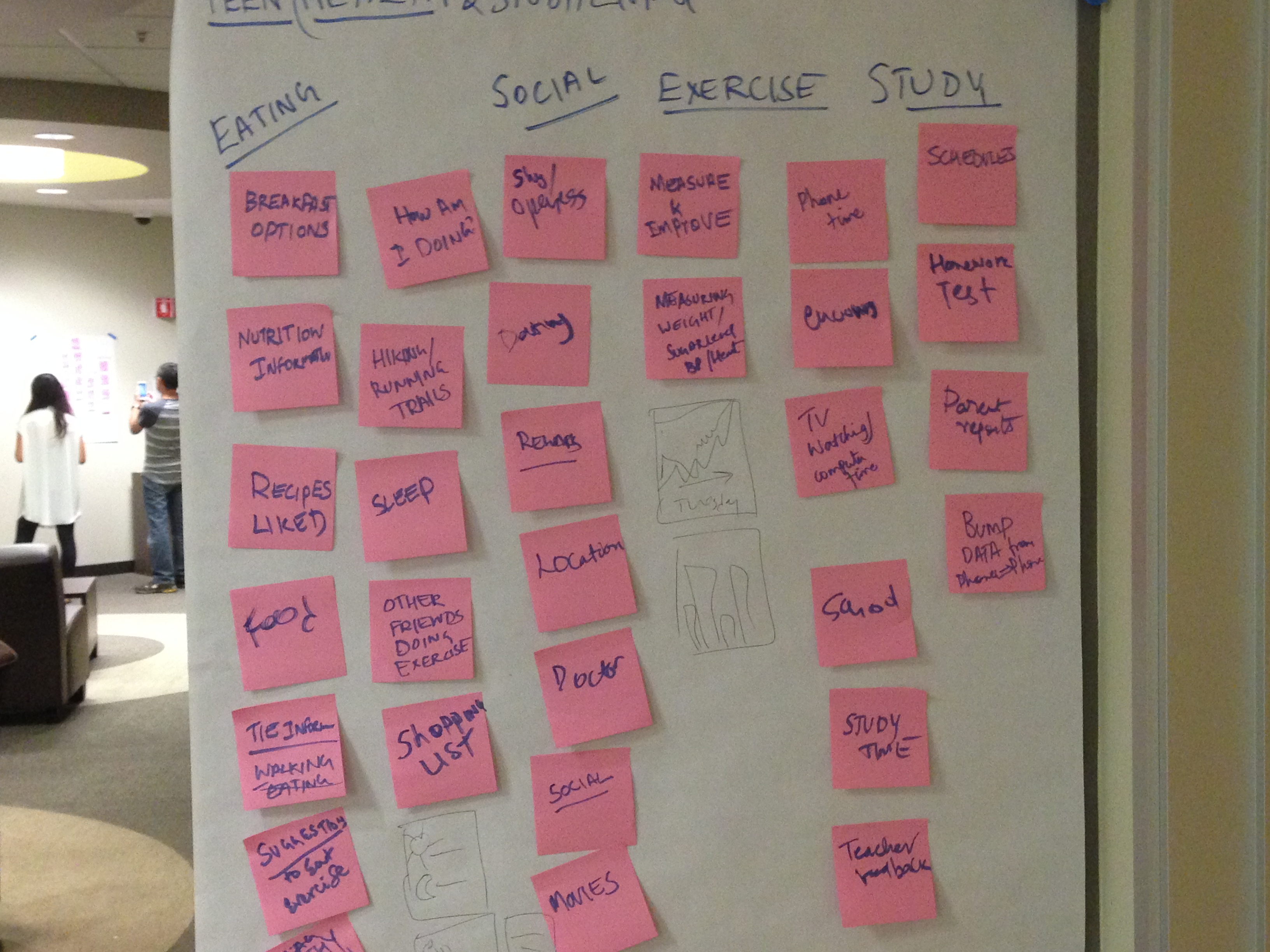
Our smart watch app was targeted at busy individuals who wants to maintain healthy eating and exercise in the midst of their hectic schedule. Watch app will work as a companion app with the mobile phone. User can store their preference for their diet and exercise in their mobile app and will receive contextual notifications and glanceable information on their watch app. Below are some notes from our brainstorming sessions.
Sketches
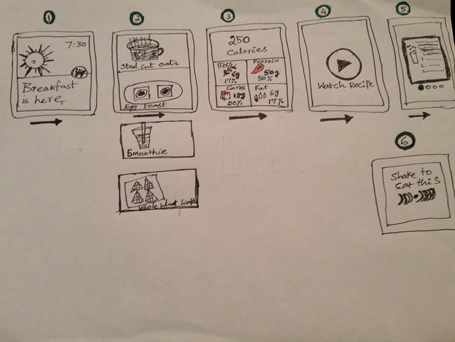
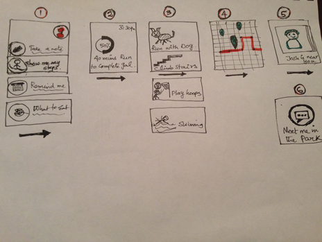
We created quick sketches to convey our product concepts and did preliminary paper prototype testing with target users.
Scenario 1: Suggest - User wake up in the morning and the watch app provides healthy breakfast suggestions in the contextual notifications stream. User can swipe right to see suggestions, nutrition information and video recipes.
Scenario 2: Demand - User can give a voice command to show how well are they doing on their exercise goals. App will show their current activity info and provide contextual activities based on their preference and location.
User Research
Results of our preliminary paper prototype testing.
| What Worked | What didn't Work |
|---|---|
| Concept was well received. | But skeptical about watching recipe videos on watch |
| They liked the food photographs in the sketches. | Cards needed better affordance for vertical vs. horizontal swipe |
| They mentioned that layout is clean and nice. | Nutritional facts information need to be readable. |
| Icons and Visualizations were clear and intuitive. | Need more actions for the food suggestions(Order , Recipe, Watch Video) |
Final Design
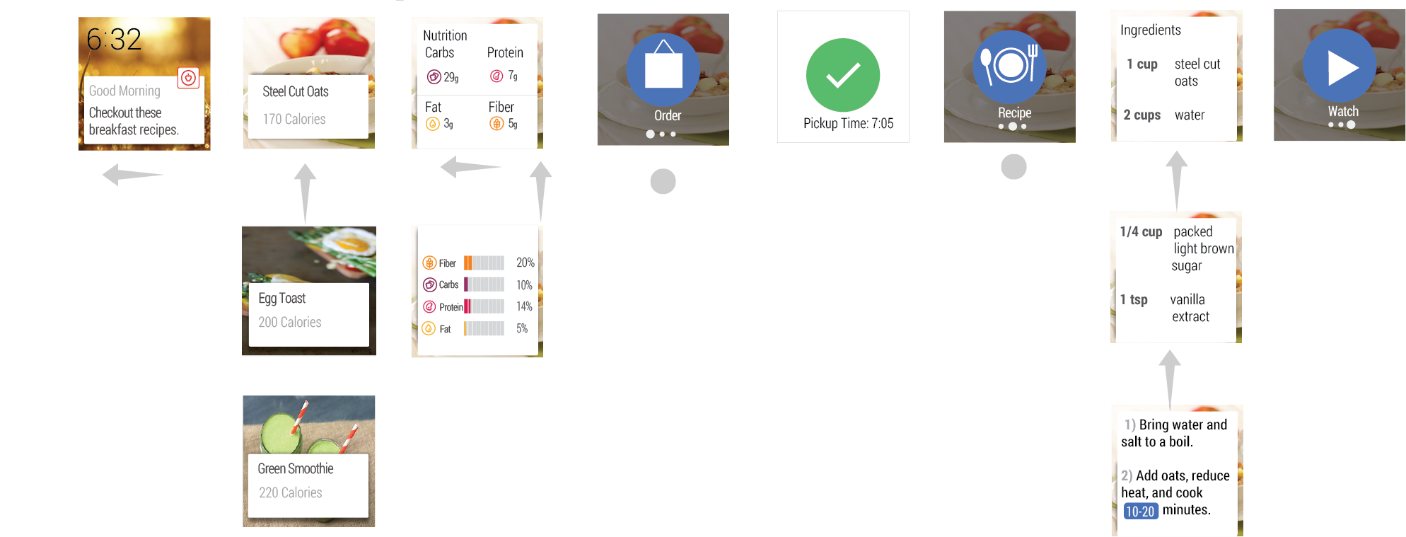
Based on the feedback we iterated on the design to incorporate the needs of the users. Below are the illustrations of the final product design and interaction.
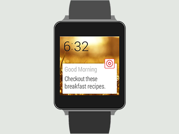
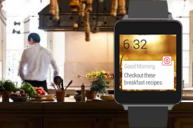
Using Cards as the foundation it shows relevant information just when the user needs it. We used vibrant background imagery, app icon and notification text inside the card.
We leveraged the 2D Picker pattern to allow the flexibility to swipe vertically to see list of options and then swipe horizontally to see detail information.
Tapping an Action button allows the action to be executed and shows the result of the action.
